

Ok here is a very very ruff design of what I had in mind with some different fonts
View Poll Results: Which font do you guys like
- Voters
- 30. You may not vote on this poll
-
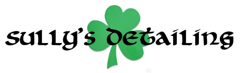
Picture 1
2 6.67% -
Picture 2
24 80.00% -
Picture 3
4 13.33%
Results 1 to 15 of 21
Thread: Sully`s Detailing: New Logo
-
12-04-2010, 04:36 PM #1


- Join Date
- Oct 2009
- Posts
- 777
- Post Thanks / Like

Sully`s Detailing: New Logo

Shawn
(954) 871-0205
-
12-04-2010, 05:20 PM #2Long Time Member


- Join Date
- Jul 2003
- Location
- Utah
- Posts
- 10,697
- Post Thanks / Like
Re: Sully`s Detailing: New Logo
#2 has the easiest to read text.
A society willing to trade liberty for temporary security deserves neither and will lose both
ΜΟΛΩΝ ΛΑΒΕ
-
12-04-2010, 05:24 PM #3The Man Who Knows The Man
- Join Date
- Jul 2003
- Location
- El Estado Solitario de la Estrella
- Posts
- 3,983
- Post Thanks / Like
Re: Sully`s Detailing: New Logo
Yup. Originally Posted by GearHead_1

What`s the shamrock about?"If you get to thinkin` you`re a person of some influence, try orderin` somebody else`s dog around."
--Will Rogers
-
12-04-2010, 05:32 PM #4
- Join Date
- Oct 2009
- Posts
- 777
- Post Thanks / Like
Re: Sully`s Detailing: New Logo
Im Irish
Shawn
(954) 871-0205
-
12-05-2010, 09:04 AM #5
- Join Date
- Aug 2010
- Location
- Cleveland, OH
- Posts
- 16
- Post Thanks / Like
Re: Sully`s Detailing: New Logo
Personally,
I would continue to use the logo you have in your sig
-
12-05-2010, 11:40 AM #6
- Join Date
- Oct 2009
- Posts
- 777
- Post Thanks / Like
Re: Sully`s Detailing: New Logo
The one I have now is More modern yes but on my T-shirts decals ect you cant see the detailing and turns away alot of up scale clients so I am making it simple, easy to read, and I through the shamrock in there because I am irish
Shawn
(954) 871-0205
-
12-05-2010, 12:00 PM #7
- Join Date
- Aug 2010
- Location
- Cleveland, OH
- Posts
- 16
- Post Thanks / Like
Re: Sully`s Detailing: New Logo
That makes sense.. Originally Posted by sullysdetailing
I would say #2 then.
BTW, who maintains your website, I love it.
-
12-05-2010, 12:40 PM #8CCH Auto Appearance, LLC

- Join Date
- Jul 2003
- Location
- Lansing, MI USA
- Posts
- 8,783
- Post Thanks / Like
Re: Sully`s Detailing: New Logo
Definitely #2, out of the available choices. You need a tag-line though.... something like "A show car shine that`s more than the luck `o the Irish" or "Kiss me, I`m your detailer"
 Charlie
Automotive Appearance Specialist - Serving Greater Lansing, Michigan
http://www.cchautoappearance.com/
-
12-05-2010, 01:53 PM #9I have issues

- Join Date
- Aug 2006
- Location
- NJ
- Posts
- 556
- Post Thanks / Like
Re: Sully`s Detailing: New Logo
#2
POLLEN is Evil
-
12-05-2010, 04:58 PM #10

- Join Date
- Jul 2008
- Location
- Greensboro, NC
- Posts
- 699
- Post Thanks / Like
Re: Sully`s Detailing: New Logo
I also say #2 it`s the easiest to read
-
12-05-2010, 05:31 PM #11Official Wax Waster

- Join Date
- Oct 2008
- Location
- ROCKVILLE VA.
- Posts
- 609
- Post Thanks / Like
Re: Sully`s Detailing: New Logo
#2 also.
-
12-05-2010, 09:27 PM #12
- Join Date
- Oct 2009
- Posts
- 777
- Post Thanks / Like
Re: Sully`s Detailing: New Logo
I maintain the site and add all of them pictures and blog post a firend of mine made the layout Originally Posted by matth9
Thanks for all the input guys, It is going to say South Florida`s Premier Detailing Service under it
Shawn
(954) 871-0205
-
12-05-2010, 11:19 PM #13

- Join Date
- Aug 2008
- Location
- Orlando, FL
- Posts
- 219
- Post Thanks / Like
Re: Sully`s Detailing: New Logo
I agree on 2 and definitely a tag line. Maybe drop in your "South Florida`s Premier Detailing Service" under your title like my logo is. See attached. Keep it simple for sure
-
12-25-2010, 10:45 PM #14a.k.a. Troy@DetailCity

- Join Date
- Jul 2005
- Location
- Sarasota, FL
- Posts
- 2,882
- Post Thanks / Like
Re: Sully`s Detailing: New Logo
Sharp and easy to read is the way to go. DJ`s logo is very nice.

My first logo on my first detail truck was a joke. I cut my logo out of pin stripe and you had a real hard time reading what it said. It took me a couple of years to smarten up.
Some people (Dwayne) say I still am missing the boat by not actually having a logo like a muscular arm (Arm & Hammer style) but what I have now is clean and sharp and I get compliments on it all the time.
#2 gets my vote too. Although I think there`s a better one than all three if you keep after it.
-
12-27-2010, 07:11 PM #15
- Join Date
- Oct 2009
- Posts
- 777
- Post Thanks / Like
Re: Sully`s Detailing: New Logo
My new logo is actually being redesigned by a member of this forum when hes doe with it I will make sure to post up some pictures

Shawn
(954) 871-0205

 Reply With Quote
Thread Information
Users Browsing this Thread
There are currently 1 users browsing this thread. (0 members and 1 guests)
Similar Threads
-
Audi RS6 Detailing by Sullys Detailing (South Florida)
By sullysdetailing in forum The Detailers ShowcaseReplies: 5Last Post: 07-20-2011, 04:42 PM -
2008 BMW 335i Detailing @ Lashway Motorsports: By Sullys Detailing
By sullysdetailing in forum The Detailers ShowcaseReplies: 4Last Post: 05-12-2011, 04:45 PM -
Sully`s Detailing: SL 55 AMG
By sullysdetailing in forum The Detailers ShowcaseReplies: 6Last Post: 08-21-2010, 09:42 PM -
Sully`s Detailing DB9
By neomatrix in forum The Detailers ShowcaseReplies: 43Last Post: 04-26-2010, 03:17 PM -
Sully`s Detailing: X5 M
By sullysdetailing in forum The Detailers ShowcaseReplies: 2Last Post: 03-01-2010, 09:30 PM
Bookmarks